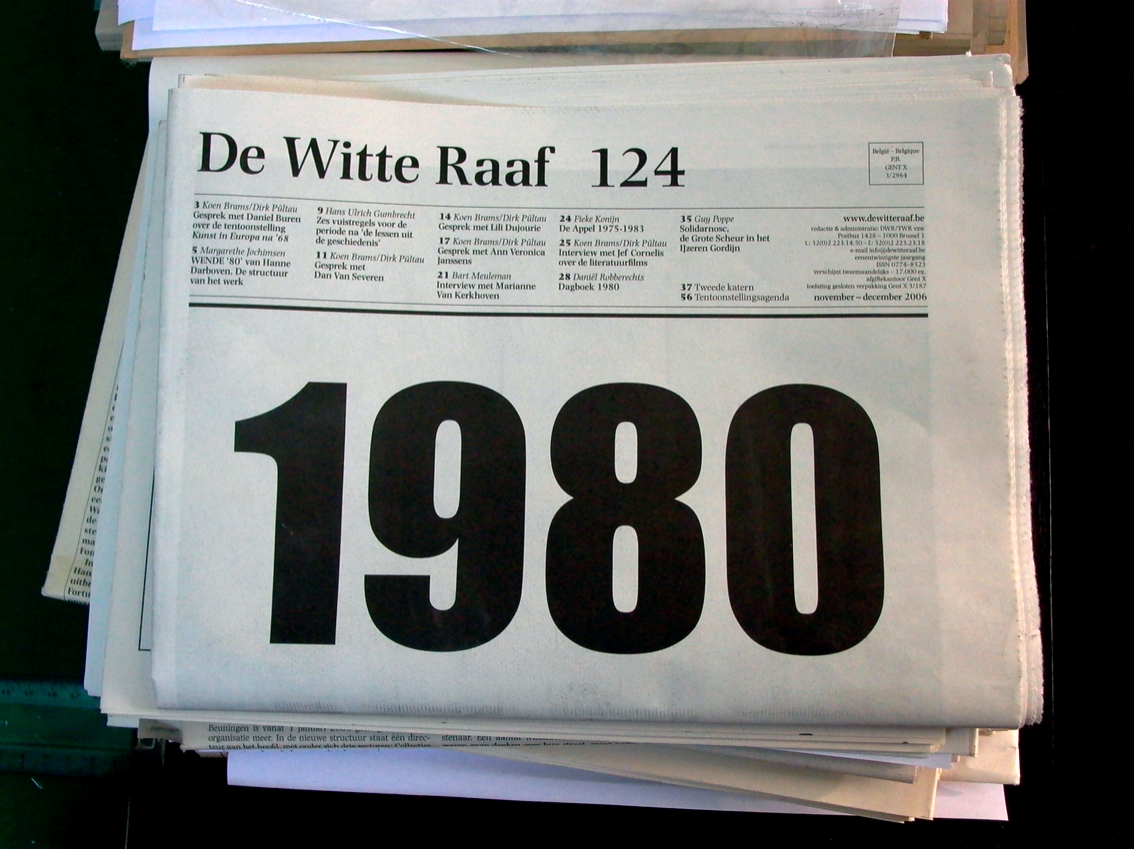
De Witte Raaf
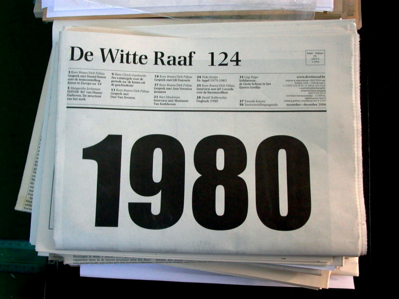
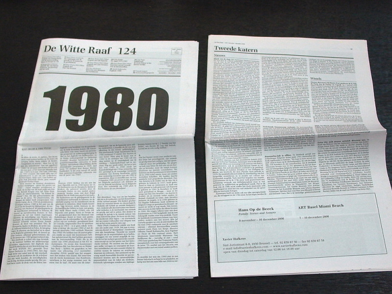
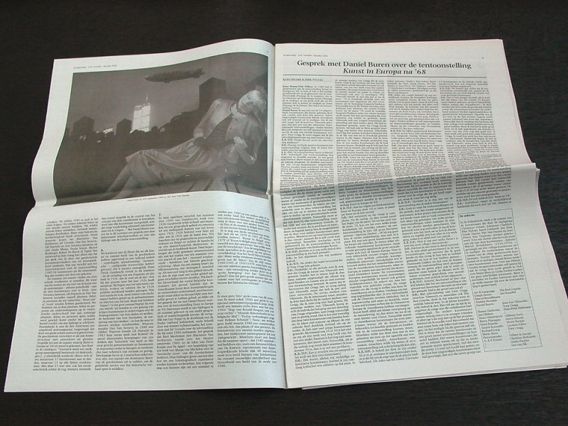
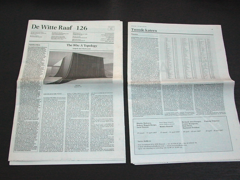
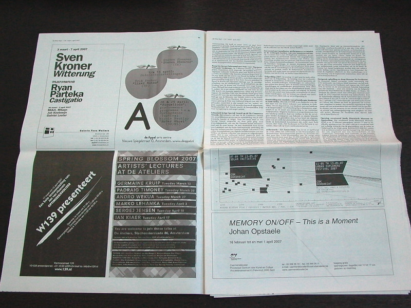
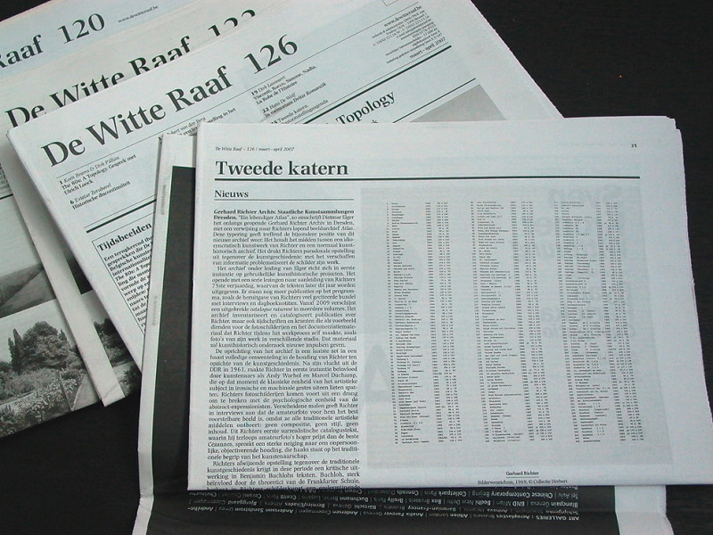
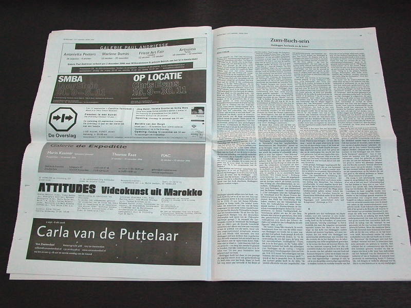
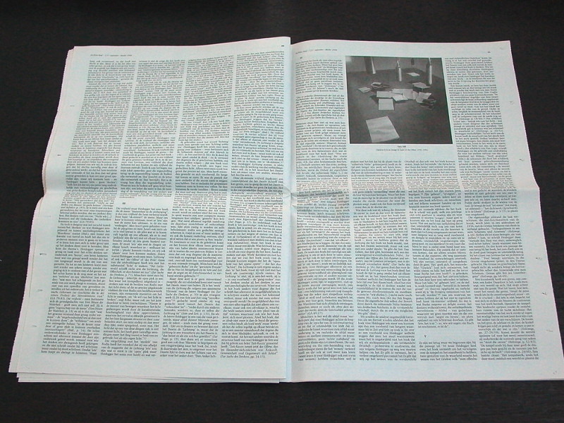
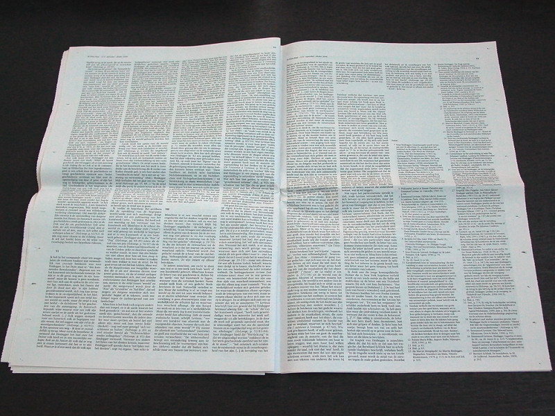
The question here was to restyle an art journal which is notorious for its extensive texts but also for its thoroughness and keen arthistorical information and research. Attention was focused on the headlines, typeface and readability. The typeface is Photina, designed by José Mendoza y Almeida (°1926) in 1972. It’s characterised by an economical use of space combined with a good readability. The text face shows an even colored grey tone. In contrast with a daily newspaper in which all headlines, texts and pictures fight for the attention of the reader, the pages in De Witte Raaf look rather comfortable and quiet, the eye isn’t agressed and has the full space to read undisturbed. Printed in an edition of more than 15.000 copies, the journal is distributed in Belgium and The Netherlands and may be picked up by it’s readers for free.